Look is key
packaging design at “world of coffee”
Coffee and visual creations are two of our very big passions.
So when we went to World of Coffee, that to our luck took place in our hometown Berlin this year, we kept our eyes open for the most intriguing, interesting or simply the most beautiful coffee packaging designs.
Boy were we surprised how many we found!
Here are our very personal TOP 11:
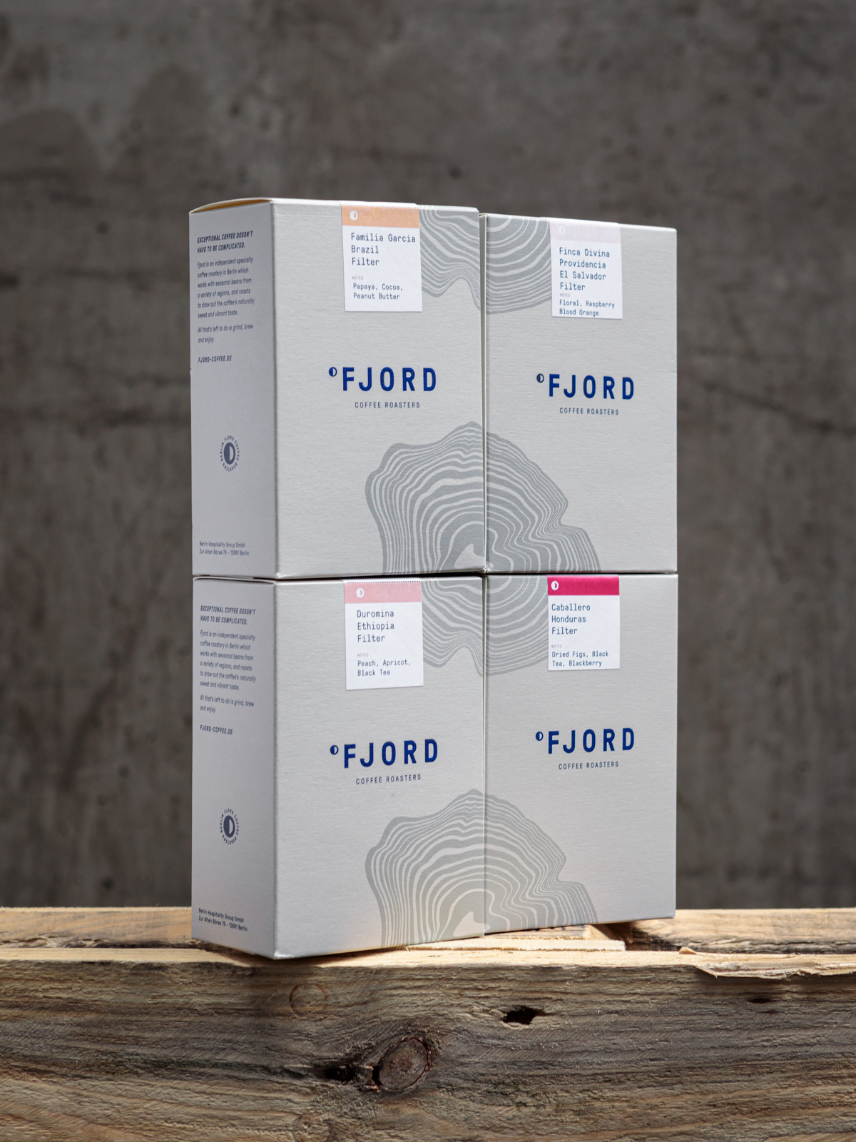
Fjord
Berlin – since 2016
Company:
Founded by Morgan Love, James Maguire + Krésten Thøgersen.
„Fjord“ works as a really visual name, that people associate with
vibrancy and pureness. This encapsulates Fjords mission for the roasting.
The three owners of Fjord separately own and manage a few other coffee shops in Berlin: Silo Coffee & Commonground (James Maguire,
Morgan Love ), Father Carpenter (Krésten Thøgersen).
Packaging Design:
Marie Stadelmann, Berlin.
Design Concept:
The main thought was an abstract association with exploration and nature. The Suminagashi, created after the Japanese ink technique, allows for a wider interpretation, from contour lines of a map to the cross sections of trees.
Four boxes combined create a full sized Suminagashi.
What more to know?:
Wherever in the world you are, Fjord’s subscription service delivers fresh coffee direct to your home or office door at the quantity and frequency of your choice, so that your favourite roast is always on hand.
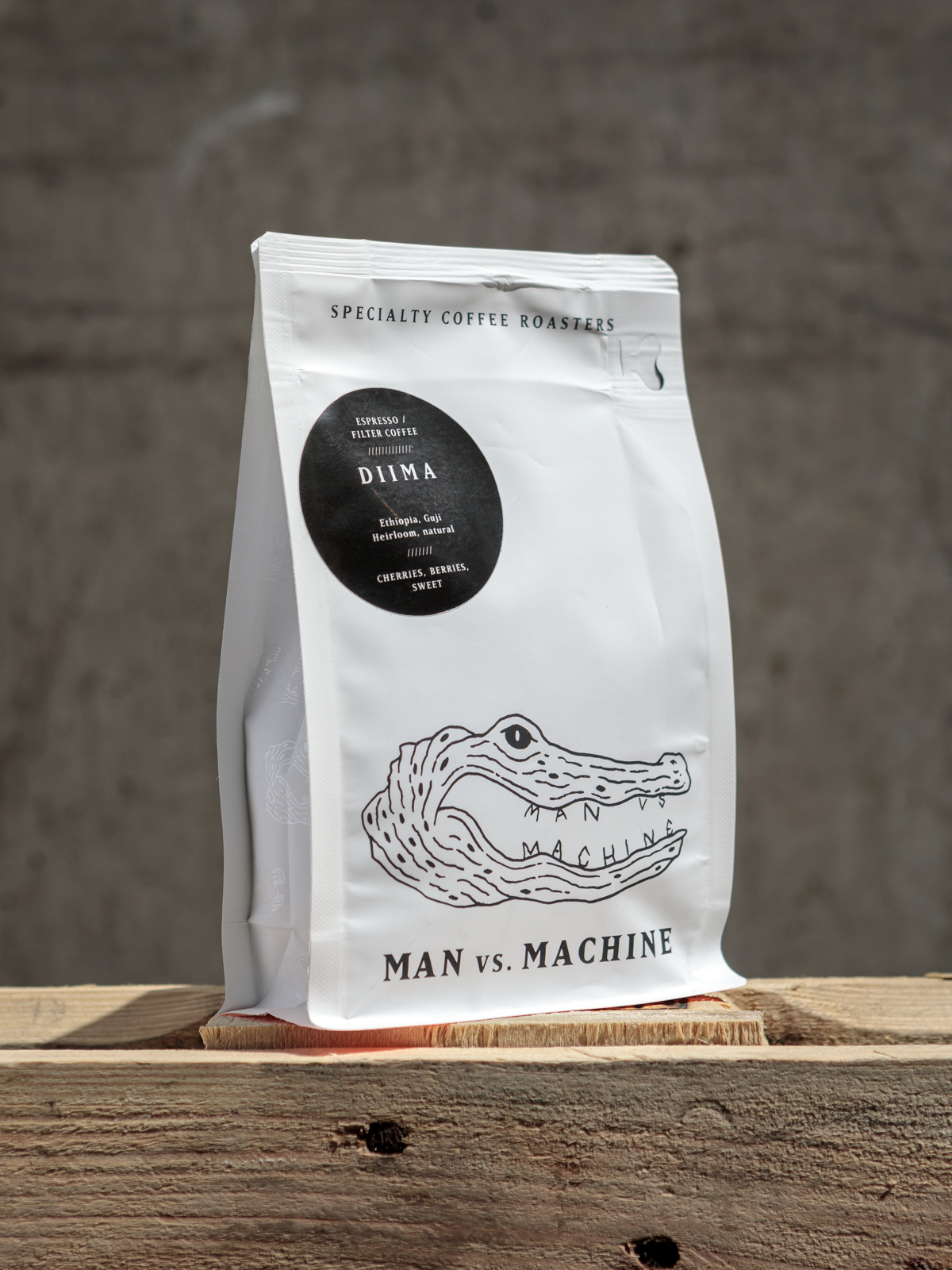
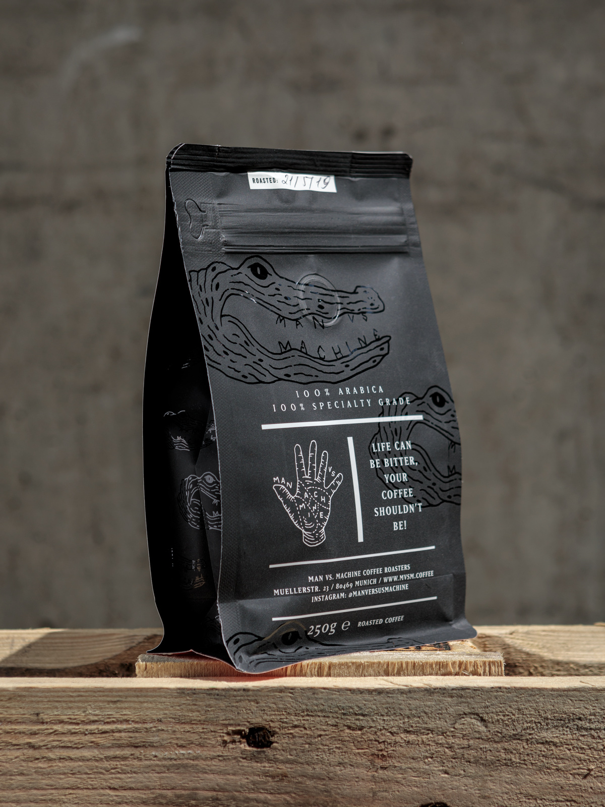
Man vs. machine
Munich – since 2014
Company:
Founded by Cornelia Mehrwald + her husband Marco Mehrwald.
„Man vs. Machine“ really is a statement for handmade craft compared to automatic produced goods.
The roastery is located in the Kolosseum in Munichs Glockenbachviertel,
with the cafe just 50 meters away. A new coffee bar might open soonish in the Maxvorstadt area.
Branding + Logo Design: Jon Contino, NY.
Packaging Design: by MvsM themselves.
Design Concept:
The briefing for the company design was “Scandinavian freshness meets California Skate Culture meets Japanese attention to detail“. Jon came up with 12 ideas – 11 had to do with the man/machine concept, one did not:
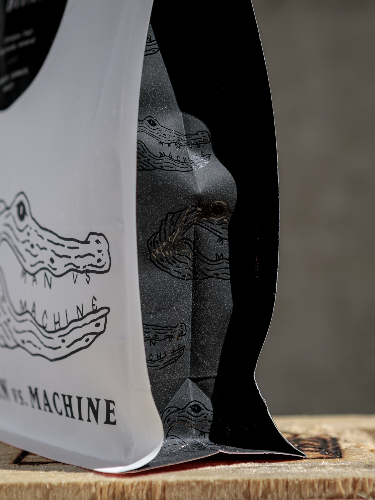
the crocodile – and we totally fell in love with it.
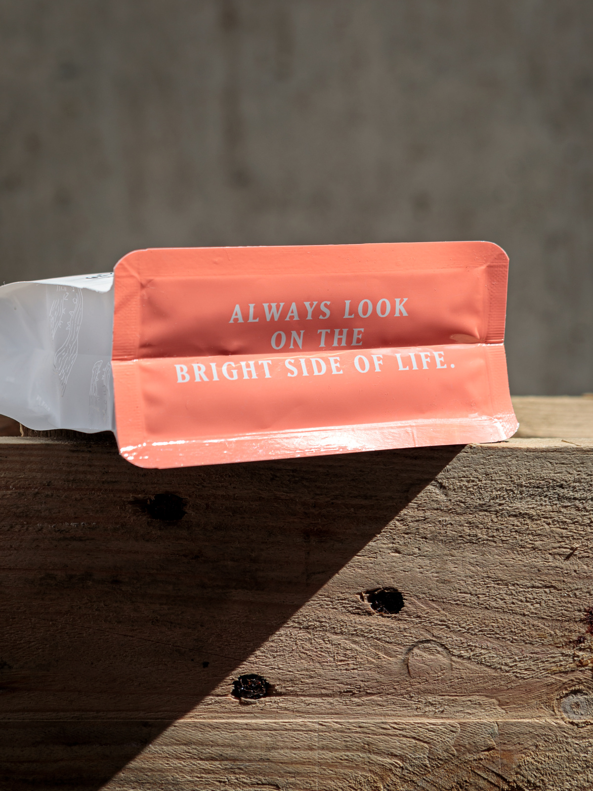
For the bags we wanted the curious customer to discover something at second sight – that’s where the message on the bottom originated. And we wanted it to feel interesting as well, so it got a special varnishing.
We believe that the bag is a part of the overall experience when having our coffee – so it should make a promise. and it’s the job of the coffee inside to keep that promise. Eames once said: The details are not the the details.
They make the Design. we agree 100% with him on this one.
What more to know?:
We see a lot of companies sacrificing quality for growth. We believe that’s wrong. We think if you have to decide you should always put quality first.
And the bag is just a small part of that approach.
And: As you can read on our bags, all of our bags are 100% recyclable
– because our planet is not.
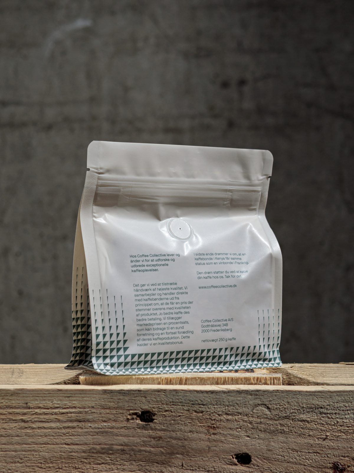
coffee collective
Copenhagen – since 2007
Company:
Founded by Peter N. Dupont, Klaus Thomsen + Casper Engel Rasmussen.
We are a green coffee importer, roaster, wholesaler and operate 4 coffee shops of our own across Copenhagen.
Packaging Design:
We did it together with Kirk, Hatch & Bloom – the agency that also did our first brand identity back in 2007
Design Concept:
We wanted to keep our triangles, which is a big part of our identity, and the designer came up with the concept of “setting the triangle free”. Before it was very much locked in a certain grid. Now it’s flowing and moving dynamically, just like our business has progressed. He also took the triangle and started drawing letters with it and came up with our very own font! We use the font to identify each of the farmers we work with.
The bottom is transparent – just like our trading model – so you can see the roast color, bean shape and size or the actual product. It’s something we introduced with our former bags and has become one of the nice details that people associate with us.
What more to know?:
Creating the best coffee experiences in the world while helping farmers achieve more value is what drives us. We work directly with farmers, pay a premium for the quality and have full transparency on the pricing. We’re roasting daily with our focus on sustainability from seed to cup.
Coffee Collective is to this day 100% owned and run by the founders.
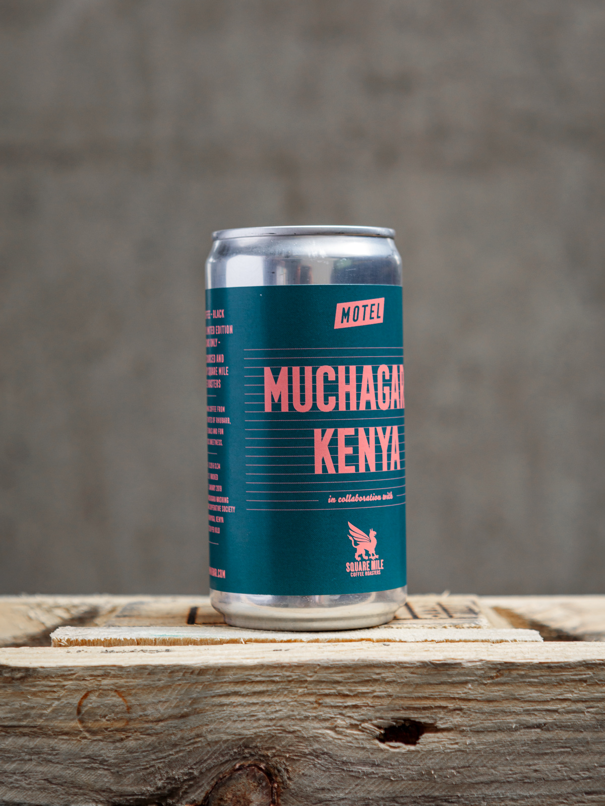
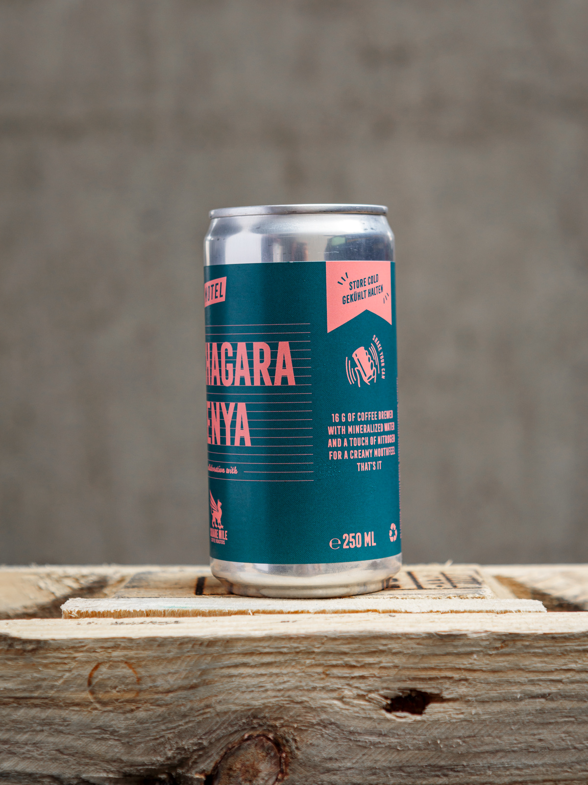
motel beer + coffee
Berlin – since 2015
Company:
Founded by Cory Andreen + Travis Wilson, who started with the coffee business. Marie Stadelmann + Peter Read joined later at the beginning of the beer journey.
We are dedicated to making coffee and beer that everyone can enjoy anywhere, anytime, without sacrificing quality or ethical production standards.
We brew and can in Berlin-Reinickendorf.
Packaging Design:
Creative Director of Motel, Marie Stadelmann, Berlin.
Design Concept:
The beer labels are inspired by midcentury travel posters and cinematic vistas. The coffee labels are inspired by classic Italian bar culture and the midcentury aesthetic espresso, amaro, etc.
What more to know?:
The most important thing for the coffee labels was to create something that looked immediately appealing and approachable for the broader public,
while at the same time including detailed information about the coffee‘s origin and transparent green coffee pricing. By working directly with producers to compact the value chain between them and the can in your hands, we aim to bridge the gap between specialised, small-batch production and casual, laid-back enjoyment.
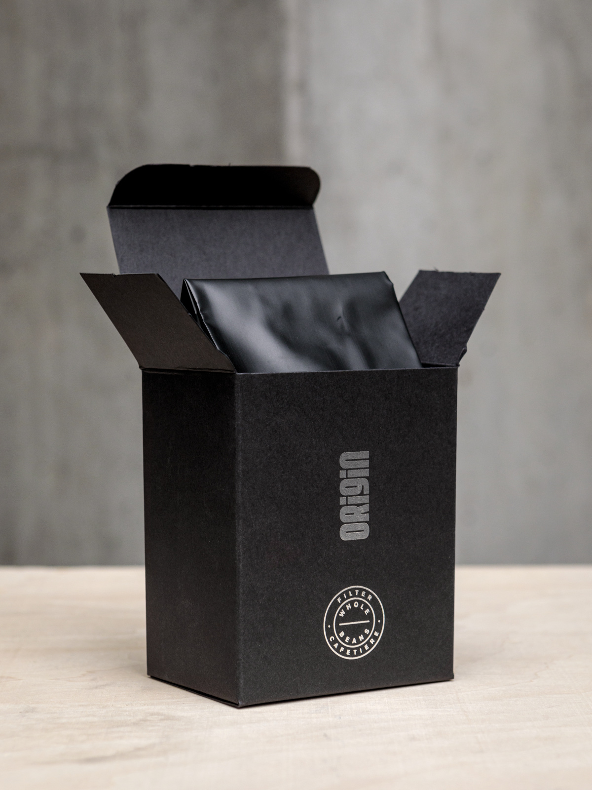
origin coffee roasters
cornwall – since 2004
Company:
Founded by Tom Sobey in 2004.
Origin Coffee is available from leading speciality coffee shops, restaurants and hotels across the UK, and also in our own coffee shops in London and Cornwall (where we still roast).
Precision throughout our supply chain is paramount, it ensures that the end product does justice to the producers. Be that in the roasting, brewing or the packaging. That’s why we put so much craftsmanship into our packaging.
Packaging Design:
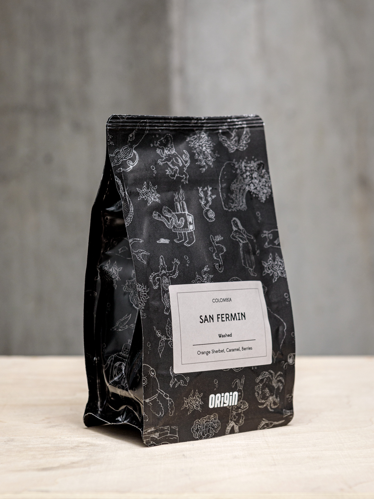
We work with A-side, a local design agency who we’ve partnered with since Origin started, to commission talented illustrators to bring our coffees to light and reflect the spirit of our brand.
Design Concept:
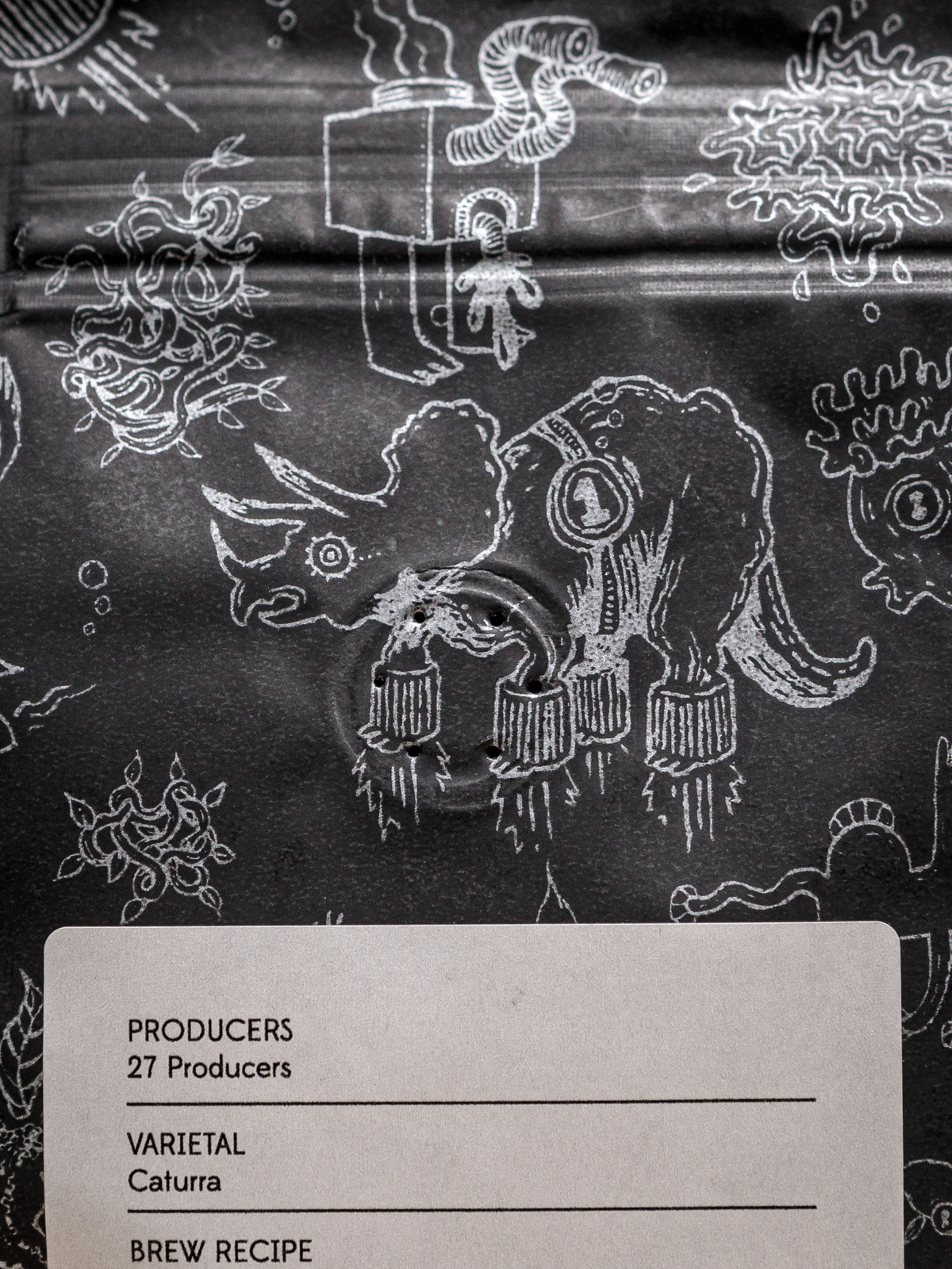
Our current bag designs enabled us to create a premium outtake without being too dry or taking ourselves too seriously. They feature John Kilburn illustrations (a local Cornish artist) which are unique and imaginative.
Every time you look at them you see something new.
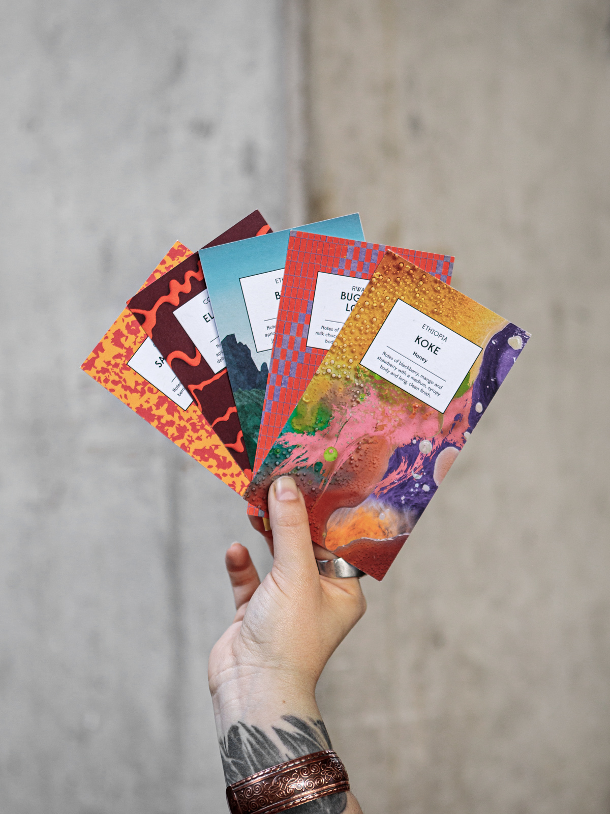
Each of our coffees (we release 4-5 each month, as well as our mainstays) then has a bespoke illustrated tasting card to accompany it. These are created to reflect the coffee itself (the flavour profile or a story from source).
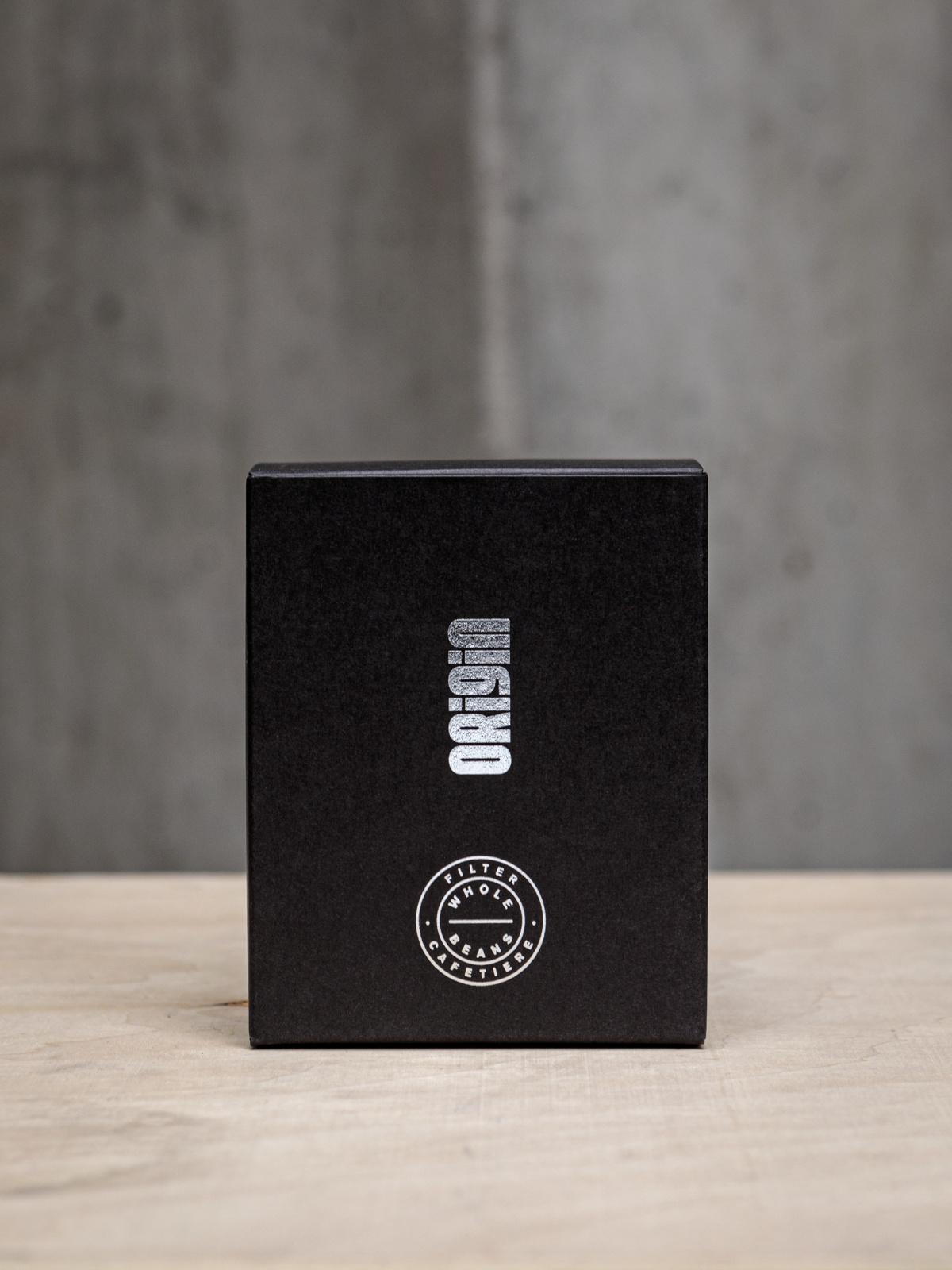
Illustrations then continue on our Special Edition Series box wraps,
featuring ‘other worldly’ commissioned illustrations printed onto metallic stocks to reflect their position as the world’s most Incredible coffees.
They’re quite simply out of this world.
What more to know?:
Our business is shaped by the desire to empower and enthuse people at every stage of the coffee journey. We curate the majority of our special coffees through direct trade, visiting and sourcing directly from producers around the world, forging sustainable long term relationships. Sustainability,
provenance and traceability are at the heart of what we do.
Bailies Coffee Roasters
Belfast – since 1993
Company:
Founded by Managing Director Russell Bailie in the mid 90s, when there wasn’t really a coffee scene of any sort. Bailies also owns Northern Irelands first and only official SCA Premiere Training Campus – providing quality, bespoke training and online brewing tutorials for trade customers and home
enthusiasts alike.
Packaging Design:
Belfast Studio Landmark, by Luke Godson & Timothy Farrell. Their own website relaunch will be live in mid-September.
Design Concept:
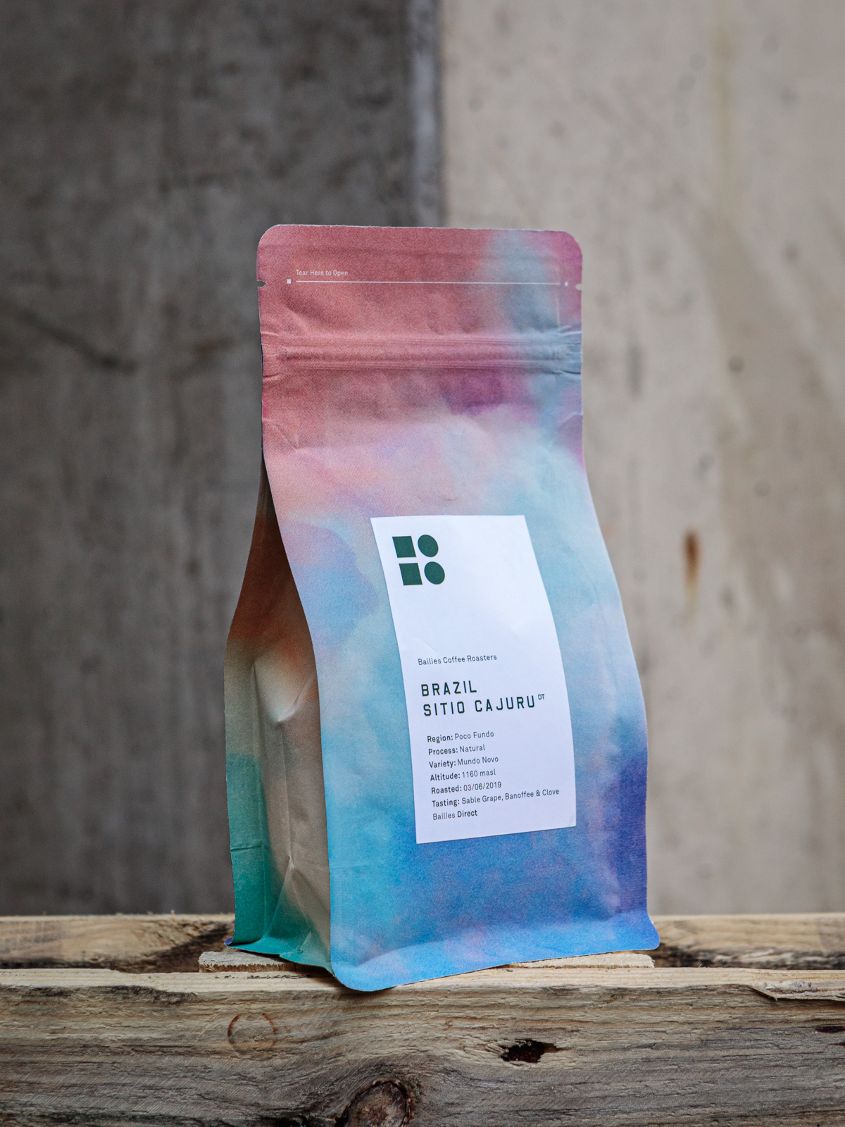
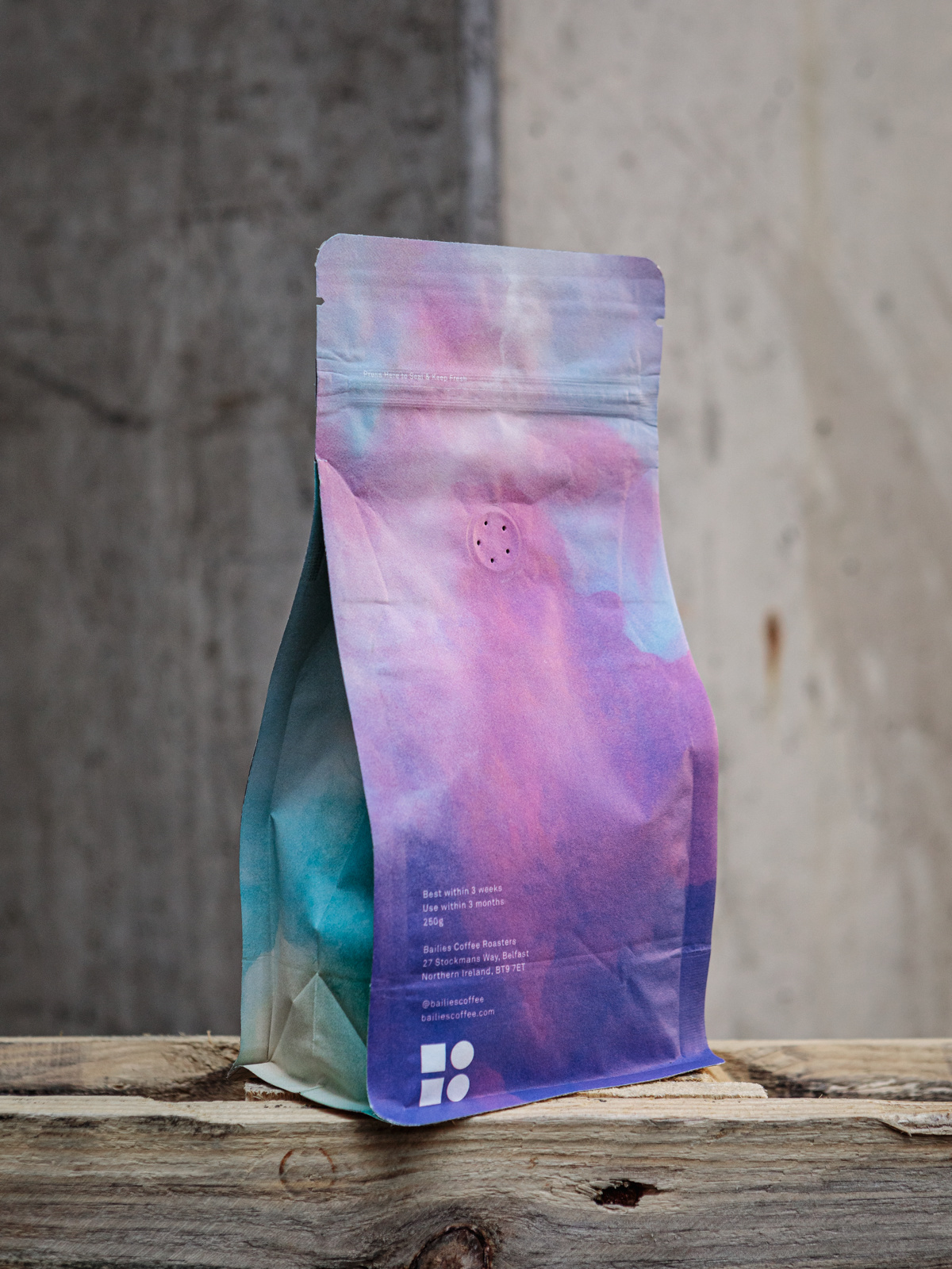
When we started exploring new packaging design, we thought that making it look nice was key, but it was much more than that – the process made us think long and hard about our role in the industry, celebrating our farming partners and ritual of brewing great coffee.
We wanted packaging that was sustainable, challenged expectations and ultimately told a little bit of our story. The huge catalogue of photographs from our trips to the origin countries of our coffees became the main inspiration for our new packaging. The design for our microlot coffee is inspired by the beautiful colours of the sunset while on our 2016 sourcing trip to Brazil. Often design can change people’s perspective on a product,
we are delighted that our packaging is as enjoyable as our coffee.
What more to know?:
Since the beginning Russell Bailie has endeavoured to support local coffee shops and equip them with the product, tools and knowledge they need,
in order to challenge the larger global brands, which have dominated our high streets. Transparency, Expertise, Passion + Innovation are the core of
our mission.
Röststätte berlin
Berlin – since 2003
Company:
Founded by Yvonne + Ivo Weller, two real hospitality professionals,
with a shared story and enthusiasm for coffee. In 2003 they founded a distribution company for professional coffee machines and in 2006 their café Röststätte was one of the first locations in Berlin, where traditional coffee culture was rediscovered.
In 2010, Ivo became chief resident coffee sommelier in Vienna. Trainings for the Arabica Q Grader and as SCA qualified trainer followed. Röststätte became one of the first specialty roasteries in Germany and is one of the leading third wave coffee roasters today.
In 2018 they opened a 2nd café at Hackesche Höfe Berlin, where they also serve coffee cocktails.
Packaging Design:
Tai Lückerath, art-director and co-founder of A NEW DAY, Berlin.
Design Concept:
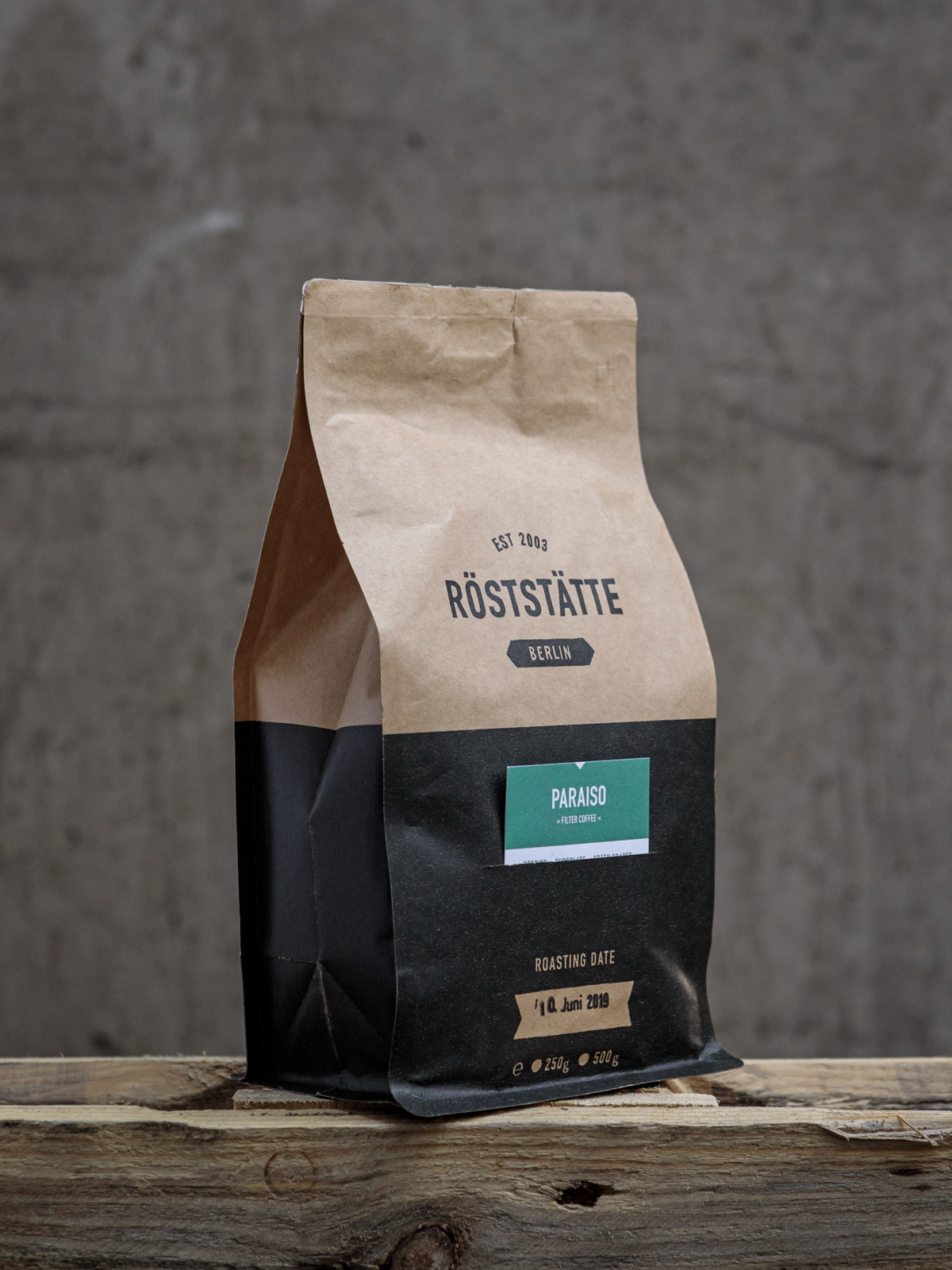
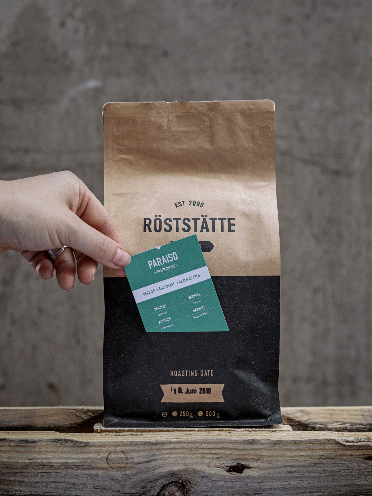
The new packaging was crucial in our value oriented communication.
It should reveal all the information about the coffee within highest standards of typographic design and aesthetics. Due to the large variety of our coffees and thus constantly changing information to display, we decided for an individual coffee card for each coffee, which is inserted on the front of the packaging. The coffee cards highlight each coffee in color and important details such as tasting notes, origins and varieties. The coffee can be re-ordered via scanning the QR-Code on the back of the card. For maximum recognition value, the customer meets the same color concept online.
What more to know?:
For us as a roaster, the coffee farmers are also producers and there is a lot of history, passion, ambition and hard work behind every type of coffee.
With our coffee cards as an elementary part of the packaging, we wanted to build a bridge between coffee farmers, roasters and consumers. And thus to raise awareness for the product and the essential work by the producers alike.
elbgold x ratsherrn
Hamburg – since 2004
Company:
Founded by Annika Taschinski +Thomas Kliefoth. “elbgold” is literally gold from the river Elbe in Hamburg.
Apart from the roastery and coffee shop at Schanzenviertel, there are locations in Hamburg Eppendorf, Winterhude and the city centre.
Packaging Design:
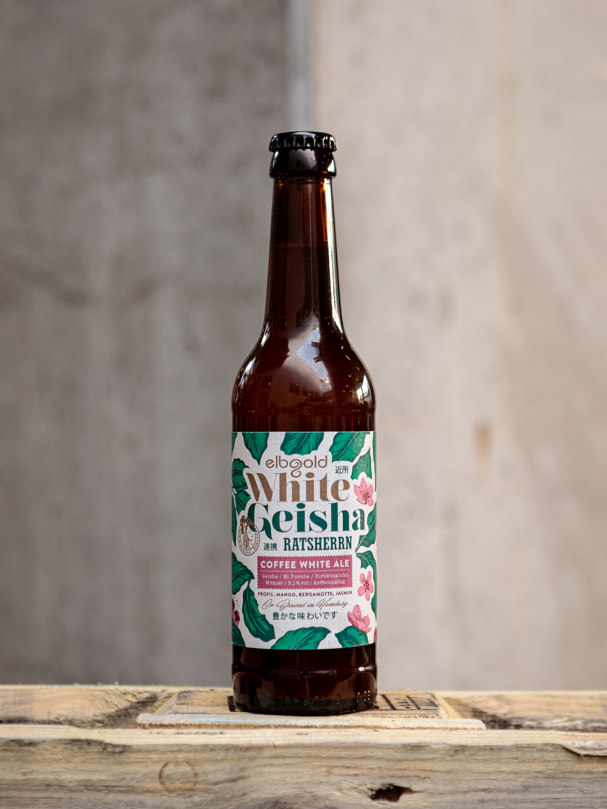
The White Geisha is a Co-Brew with Ratsherrn Brewery in Hamburg,
who assigned designer Philip Russell, team;iken
He also did the design for the 1st Co-Brew of Ratsherrn and elbgold,
named Coffee Quad.
Design Concept:
As there are further Co-Brews on the horizon, it was important to create a continous style from the beginning. In contrary to the dark, creamy and desert like Coffee Quad (their first Co-Brew), for the White Geisha Philip chose to brighten the colour palette to match the light + fresh character of the beer. Next to some cherry blossoms he also added a few Japanese characters,
that read “very tasteful”, “community” and “neighbourhood” – as Ratsherrn + Elbgold really are neighbours in Hamburgs famous Schanzenviertel.
What more to know?:
Our core values include an emphasis on sustainable crop cultivation, maintaining fair trade relationships to coffee farmers and local cooperatives, and supporting coffee development projects such as the „Cup of Excellence“.
The Geisha used for the White Geisha is produced by Finca El Puente in Honduras, sourced directly and roasted by us. It adds beautiful notes of mango, bergamot and jasmine to the beer.
cloud picker
Dublin – since 2013
Company:
Founded by Frank Kavanagh + Peter Sztal.
The name Cloud Picker came from our trip to Northern Thailand where we visited a coffee farm in the Doi Chang area on the Thai / Burma border and where we went up through the clouds to see the coffee pickers!
First micro roastery in Dublin city centre. Newly opened café at Science Gallery on Pearse Street.
Packaging Design:
Frank Kavanagh, one of the owners. Before coffee he had a successful
graphic design company.
Design Concept:
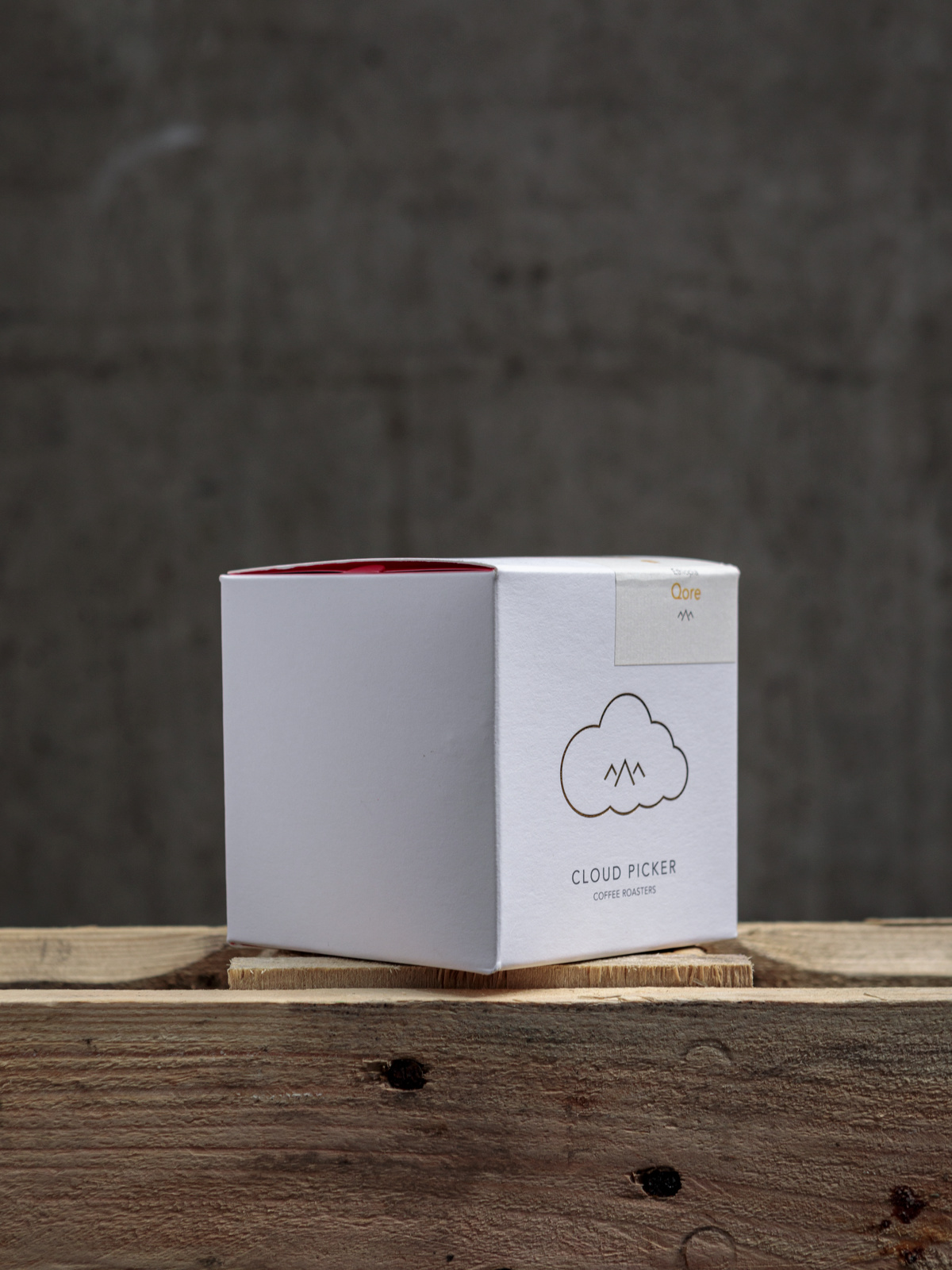
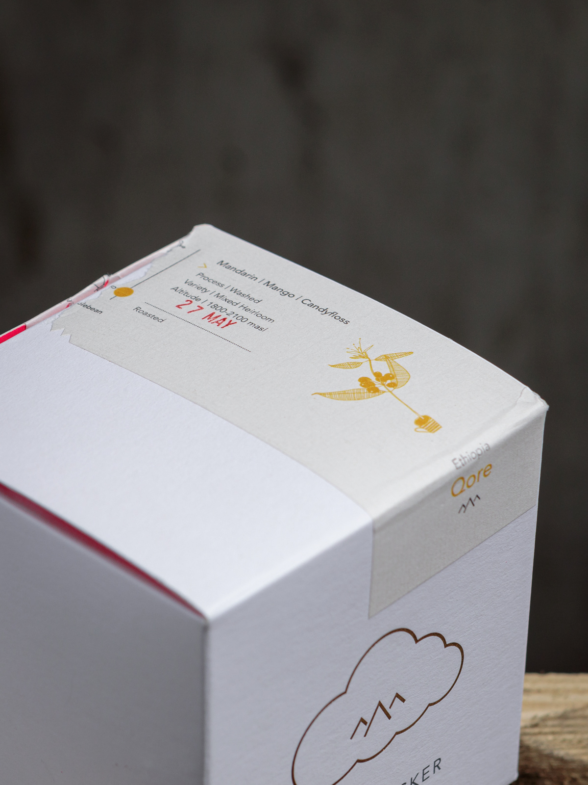
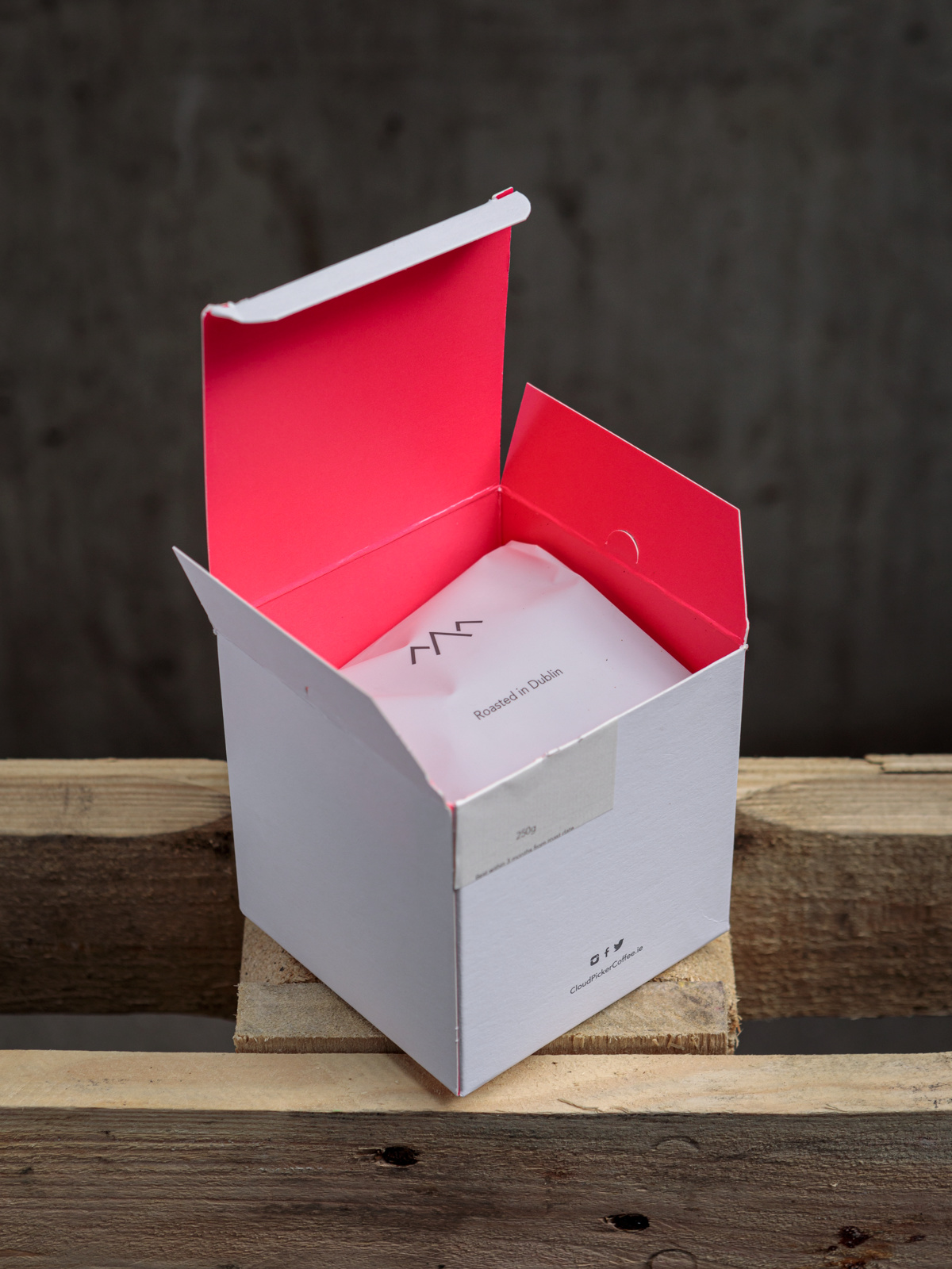
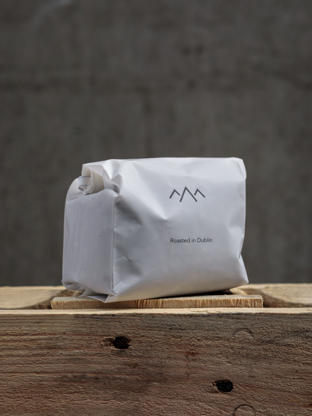
The foremost importance was it had to be eco friendly. Our boxes are 100% recyclable and our bags are carbon neutral. As for the design we wanted something simple, different to the current market and the hot pink inside gives a nod to our cheeky sense of humour…. go figure! Wink!
What more to know?:
We’re about to move the roastery to a bigger space plus get a bigger roaster!
All super exciting!
black
Kiev, Ukraine – since 2010
Company:
Founded by Viktor Shramenko.
He had a dream – it was coffee. He started with coffee trucks, build up a network, but his dream was to create a coffee company. And so he did.
Black is the people. Huge fans of good coffee.
Packaging Design:
Otherland Studio, Kiev
Design Concept:
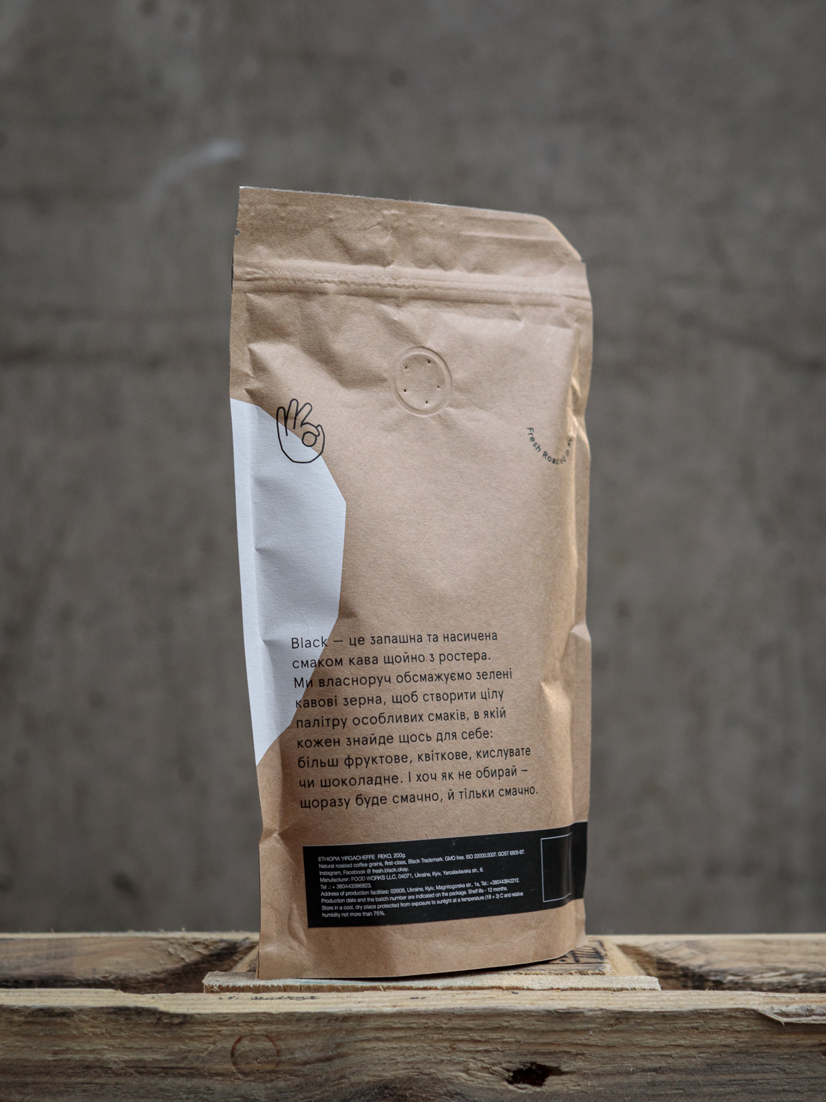
We decided to make freshly roasted coffee user-friendly: We could not simplify the coffee, but we could minimize the complexity and doubts in the process and help people becoming familiar with fresh roasting. Each design detail is helping people understand the product.
What more to know?:
We have our own production facilities with the legendary 1973 Probat, that is unique in Ukraine. Our head roasting master dedicated almost a year to bring it up to date. Its peculiarity is the cast iron drum, in which beans are roasted homogeneously to the maximum.
good spirits
Berlin – since 2014
Company:
Founded by Mascha + Florian Häupl, Good Spirits is a brother and sister operation. True family business. <3
Also on the team: Simone König. Her taste buds never lie – she is a well known competitor in both national and international coffee competitions and a sommelier for coffee.
Packaging Design:
Amélie Graef, Münster
+ Julia Klaus, Hamburg.
Design Concept:
The design is built around what Good Spirits stands for: joy, positivity,
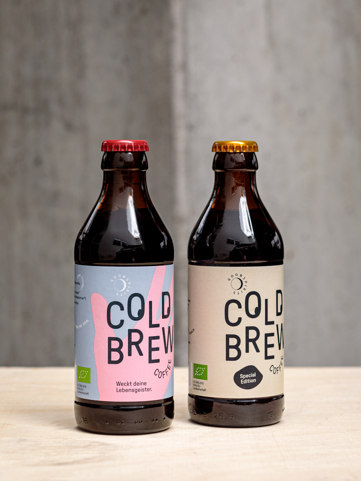
high quality. Our claim is „lift your spirits“. That’s why Amélie and Julia came up with the hand on the bottle: „raise your hands up in the air“. This is also mirrored in the colors which bring brightness and a fresh modern look into the often very dark and “craft style” cold brew product category.
What more to know?:
We have been the first to introduce cold brew to the German market.
Since 2018 we have also started producing cold brew for other companies, especially coffee roasters. These collaborations are always very exciting for us, helping spread the cold brew love to an even wider audience.
We have set ourselves the goal to redefine the coffee experience for the
21st century


